Quiet Corners
UI design for a responsive web based application for anyone looking for just the right spot - whether it be for a quiet reprieve, a group meeting, or a first date.
About this project
Responsibilities
-
Concept
-
UX Research
-
MVP
-
Wireframes
-
Testing
-
UI Design
Background
My goal for this project was to design a responsive web app for location based recommendations. I conducted research to determine what users require and the problems that they face with existing options. I also reflected on gaps that I experience while using location-based apps and developed the following hypothesis:
Travelers, particularly introverts and those with sensory-sensitivities, look for quiet places while traveling.
Research
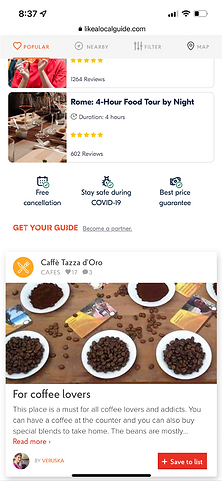
I conducted a competitive analysis on similar apps to determine their strengths, weaknesses, opportunities, and threats. I also reviewed their key UI design patterns. I combined this information with user research to create a clear direction for designing.
Competitive Analysis - SWOT
Like A Local

-
Strengths
-
Destination-forward design, with an extensive list of large cities around the world
-
Individualized recommendations, tour options, ability to connect with a local
-
Weaknesses
-
Most recent promotional posts and activity appear to be from late 2021 (not very active)
-
Difficult to find the blog (link in the footer)
-
Unclear if the web app is still active after acquisition
-
Opportunities
-
Better marketing strategy with more frequent and consistent posts across platforms
-
Improved navigation on the home screen, with easier access to the blog and
-
Expand the app to USA markets
-
Threats
-
Sites and apps such as Lonely Planet, wanderlog, Withlocals,and TripAdvisor
-
Travel blogs and websites that focus on giving travel tips and advice
Wanderlog
-
Strengths
-
Ability to plan multiple trips and invite others to see your trips
-
Features to track all aspects of your trip: places to visit, map to plan route between sites, budget, itinerary, etc.
-
Good options for minimizing features when not in use, and collapsing/expanding photos
-
Free, with option to subscribe for enhanced features
-
Weaknesses
-
Hard to find any information about the company on the website, which may undermine trust in the product
-
Difficult to find the blog (link in the footer), and blog cannot be filtered or reorganized
-
Unable to manually adjust routing on the map in the free version (subscription allows you to “optimize route”), or distinguish between walking, driving, and public transportation
-
Opportunities
-
More activity on social media; Facebook, Twitter, and Instagram were last updated in September 2021
-
Improve ability of adding items to the itinerary once they are already on another list (e.g. Places to Visit), without having to open the map
-
Allow limited offline access without a subscription
-
Have a walking and public transportation option on the map
-
Have different subscription tiers (currently one, $49.99/yr)

-
Threats
-
Sites and apps such as Lonely Planet, Withlocals, Like A Local, and TripAdvisor that help plan destinations/sites to visit
-
Apps such as Tripsy, TripIt, and Trip Scout which help users organize their itinerary
-
Travel blogs and websites that focus on giving travel tips and advice
Competitive Analysis - UX Patterns
Like A Local

-
Usability
-
Very easy to find destinations and own user profile
-
Not easy to find ancillary information, such as blog posts
-
Contrast could be improved for clickable text, which is a dark orange color
-
Layout
-
Easy to understand layout on each page
-
Navigation Structure
-
Main navigation is under the user profile and expands on hover/click, so it is not visible to the user at all times; all other navigation items are in the footer
-
Compatibility
-
The web app appears to work across devices and browsers within iOS
-
Calls To Action
-
Login/sign up are at the top right, easy to find but not blocking the page and are not necessary for accessing information
-
The process is easy and straight-forward, and unlocks additional features
-
-
Link to the native app is below the fold on the page, so it’s findable but not obtrusive
-
No apparent pop-ups or adds
Wanderlog
-
Usability
-
Generally easy to interact with and navigation
-
Learning curve for adding items to the itinerary rather than to a separate list
-
Not easy to find ancillary information, such as blog posts and company information
-
Layout
-
Easy to understand layout on each page
-
Good use of contrast, whitespace, and text hierarchy
-
Easy to expand/collapse multiple features to maintain a clean layout
-
Navigation Structure
-
Main navigation is under the user profile and expands on hover/click
-
Second menu icon on the left margin within your trip screen , which opens a navigation sidebar for your trip page
-
No access to profile (and associated menu items) within trip page
-
Expanded information for each destination is on the map
-
Compatibility
-
The web app appears to work across devices and browsers within iOS
-
Calls To Action
-
Login/sign up are at the top right, easy to find but not blocking the page and are not necessary for accessing information, though users are directed to do so via multiple screens and modals
-
The process is easy and straight-forward, and unlocks additional features
-
-
Link to the native app sits at the top right of the screen within each trip page
-
No apparent pop-ups or adds after initial subscription offer shown upon signup
-
Easy to distinguish based on color use

User Interviews
After completing the competitive analysis, I conducted user interviews to gather information about the wants, needs, and pain points for users of location-based recommendation apps.
Takeaways:
-
Many types of users would be interested in finding quiet places, not just introverts and those with sensory sensitivities
-
Users would like to find quiet corners for a variety of reasons beyond what I hypothesized, including work meetings, dates, and study groups
User Frustrations:
-
Being required to login or have a paid account to access features
-
Decibel meters being used, as they have unreliable readings
-
Not having access to maps or information without WIFI access

Personas
Using the information gathered via interview, I developed three user personas to use as a guide for my design process.


User Stories
By considering personas representing the varied needs and perspectives of my target users, I crafted specific user stories which could then be translated into uses journeys.

Getting Started
Defining The Problem Space
The final step in fleshing out the problem space is defining a minimal viable product by separating user wants from user needs. Using the resulting basic requirements, I generated a user flow and sketched out low-fidelity screens.
Minimal Viable Product
Screen requirements to meet user needs were developed from two of the above user stories:
-
“When I open an app while traveling for business, I want to be able to use it with minimal steps, so I can focus on my work.”
-
“When viewing reviews, I want to see a quick, easy breakdown of the qualities of the location, so I can know at a glance if it’s what I’m looking for.”

User Flow

Specific User Flows, Highlighted

Screen Sketches
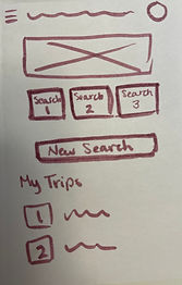
These initial sketches allowed me to visualize what the user flows could look like and how different components could be incorporated in each screen while appropriately matching the needs from the user stories.

Usability Testing
Using an interactive paper prototype, I conducted usability testing with the following objectives:
-
Measure how quickly users can route to a location without logging in.
-
Measure how quickly users can route to a location after logging in.
-
Find out if users enjoy the layout and functions of the results page.
-
Find out users’ thoughts on the preferences modal.
Takeaways:
-
Users wanted specific preferences included in the modal, such as places with food / drinks, pet- friendly locations, and family-friendly locations.
-
Users want an option to filter by distance from current route.
-
Users wanted items with detailed ratings to be consistent across locations.
-
Users had some confusion with button hierarchy and function.

A/B Testing
Testing is important to incorporate at each stage of development. I utilized preference testing for a variety of visual components while completing the high-fidelity wireframe, including for the background (dark, or with light overlay), hero image, and buttons.
Here are A and B options representing early iterations of the Home Screen, next to a final version of the screen.
A

B

Final

Designing
Low-Fidelity Wireframes
I utilized an iterative process to optimize screen composition and flow by quickly generating multiple sketches for each screen required for the entire flow. These sketches are the final low-fidelity result of the iterative process and set the stage for me to create digital mid-fidelity screens.


Responsive Sketches
With my low-fidelity mobile screens planned and sketched, I created responsive versions for two of them.
Home

Search

Visual Inspiration
To develop a moodboard, I considered the purpose of the app, its functionality, and the target audience represented by the personas.

Style Guidelines
WIth the reference of my low-fidelity screens, user personas, and data from my research I translated the moodboard into a style guide that I could apply once I reached the high-fidelity stage of wireframing.


Mid-Fidelity Wireframes
The next step in the process was to develop digital wireframes at mid-fidelity. I used this format to better gauge the fit of components on each screen and make adjustments as necessary.


Responsive Screens
Home


Search


Finalizing
High-Fidelity Wireframes
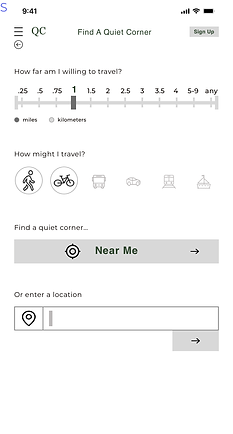
Finally, I applied the style guidelines to my mid-fidelity screens to create high-fidelity ones. With these, I was able to conduct additional user testing to refine various design elements.
Mobile Screens


Responsive Screens
Home


Search


Mockups
A digital view of select high-fidelity screens in their respective devices.


Where to go from here
Next steps for the app
-
Conduct user testing to find pain points in high-fidelity wireframe and update as appropriate
